The slightly weird, potentially sarcastic, not your average interior design blog.

Full Reveal of My Modern Bathroom Renovation + 4 Tips For Where To Splurge and When To Save
Well, the bidet works. I definitely just laughed out loud and may even have snorted a little as I sit here writing out what happened to …

Well, the new bidet works.
I definitely just laughed out loud and may even have snorted a little as I sit here writing out what happened the other day at Easter.
My eldest sister, Erin, (who, mind you, has a genius IQ) was in the middle of her tour of our new master bathroom when she apparently didn’t know what the little knob on the side of the toilet was for. So of course, she bent over to look at it and twisted the knob. All.The.Way.
Helloooooooo old faithful. And a toilet-water soaked sister.
And then there were three of us on the sidelines. Pretty much dying of laughter. And definitely not helping her.
—
That said, our bathroom is finally done. It was one of my top spaces to renovate when we bought this fixer-upper. The peach, gold, beige, and brown 90’s decor vomit just wasn’t doing it for me. Shocking, I know.
So here was the reno plan: replace floor tile, get new countertops, paint walls and cabinets, tear out existing shower insert and tile it, tile the entire back wall, and few new finishes and smaller items like mirrors, lighting, toilet, and shower door. Now, if I lived a perfect world, this bathroom would also have had a new freestanding bathtub, custom vanities with a boatload of more storage, and we would have expanded the footprint of the shower (Lord knows I love a LOOONNNGG shower where I pretty much just plop myself on the floor and sit right under the shower head).
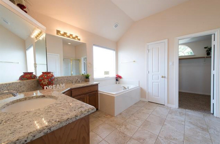
A “before” picture from one of the real estate listings.
But alas, my world is far from perfect (and I quite prefer it that way - perfect is boring). In this case, our budget was way lower than I would have liked since our timeline for completing this project was bumped up by about a year. We weren’t planning on tackling the bathroom update until next summer, but our foundation decided to give out last fall and caused a ton of leaks upstairs in our bathroom … leaking all kinds of gooey brown disgustingness and smelly water all over my kitchen and dining room. From there, it was just a slippery slope of one “small” fix to doing a complete renovation. It started with our shower pan that was cracked and leaking, but the shower was a cheap ‘ole 90’s insert, so the whole shower had to be torn out. Other than that, there were no other “real problems” in the bathroom that we knew about. But OF COURSE you’re thinking, why do all that work to redo the shower and not fancy up the rest of the place?
Me and you, we’re on the same page.
And so we redid the whole bathroom. I wanted it to feel bright, light, slick, and modern with just a hint of whimsy and fun. The rest of my house has been updated to a modern eclectic aesthetic, and the bathroom needed to be cohesive. But, it also had to be good for resell, so no super polarizing choices.
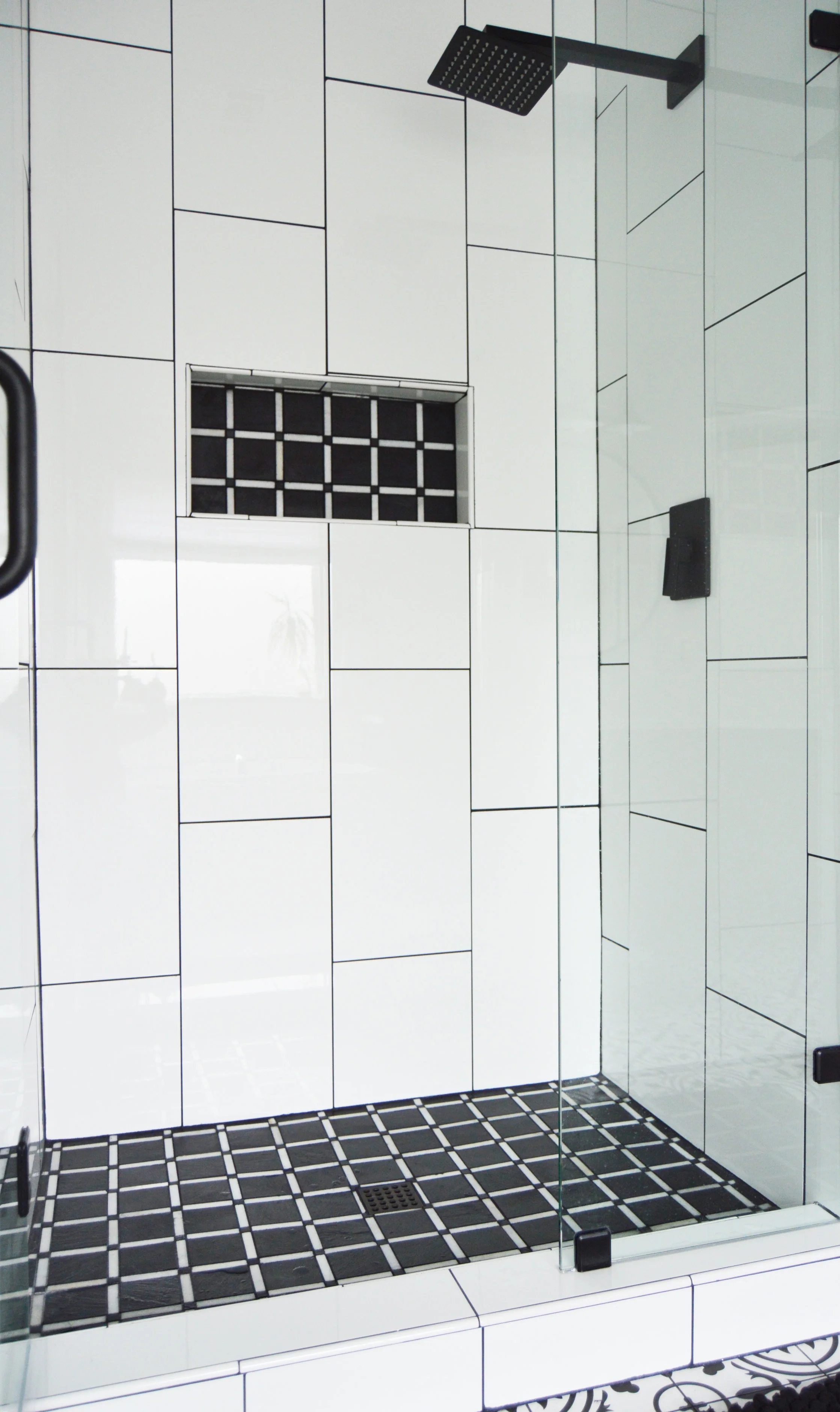
Here is all the shiny white and matte black goodness…


I decided to take the wall tile all the way up to the ceiling and expand it across the back wall. The bathroom has unique angles and a tall ceiling so I wanted to show off its assets. To bring your eye up and make the room feel more grand, I had the tile laid in a vertical brick rather than your standard horizontal brick pattern. So that the grand wall of tile wasn’t jarringly white, I used a contrasting black grout, and carried it throughout the floor and shower floor tile as well. Though, to be honest, I also did black grout because I have a thing with white grout. The thing is that I hate it. White grout is so impractical in an area with soap, scum, and moisture — making it impossible to keep it looking clean. It’s like the equivalent of wearing white pants when you’re the mom of a toddler. STOOO.PID.


I removed the door on the linen closet, painted the inset black and gave it some wooden shelves to give it a more modern, edgy look (and there were just too many doors in this small of a space). The oversized mirrors had to go, and were replaced with simple 38” black framed round mirrors. We added a few white lacquer uppers to the middle of the vanity for additional storage, and I specifically chose lacquer to mirror the polished white on the wall tiles.
Overall, I love how it turned out and I’m not sure I would have done anything differently.
And since we were on a tighter budget, there had to be places we splurged and places we needed to save. Here were my top four:

SAVE: Sink faucets. We were planning on salvaging our current faucets, but they got cracked when they were removed. So, I got these cute little vintage-looking ones for ONLY $32/each! While I wanted to go matte black to match my new shower head, the bathtub hardware had to stay put (and is ugly chrome and gold), so I needed to find faucets that married the tub fixture with the shower fixture.
SPLURGE: Shower head and knob. This 8” square matte black fixture was a pretty penny at a little over $300 and worth every cent. It shoots out water at just the right pressure, looks gorgeous, and makes the shower “experience’ feel lux. Seriously. Makes me feel like I’m in one of those weird tropical Herbal Essences commercials (and don’t pretend you don’t know exactly what I’m talking about). Who wants to completely update your bathroom and then have your cheapo shower head spit on you like a dainty southern woman. No way jose.
SAVE: Wall tile. I tiled the shower walls, plus the entire wall next to the shower. And while my contractor pretty much hated me for it, it turned out spectacularly gorgeous and is definitely a “WOW” factor. That said, it was a lot of square footage to cover and would have completely broke the budget if I picked a pricey item. The tile I chose was only about $1.75/sq ft! It’s a high polished white ceramic 12x24.
SPLURGE: Shower floor tile. There’s only a tiny amount of square footage to cover here, so splurge away! Adding a super fun pattern or splash of color to your shower floor and niche is a really great and affordable way to give your bathroom a unique and custom look. The plaid slate mosaic I chose was about $10/sq. ft.
3. SAVE: Keeping existing cabinetry and painting them instead. I don’t love the look of my cabinets but it was just not in the budget to get new ones. So I painted them black to minimize the dated curve that the cabinet has, and it definitely gave them new life.
SPLURGE: New countertops, ESPECIALLY if you can’t get new cabinets — they will completely and immediately update the space. I opted for a clean white quartz with a slight grey speckle. I love veining in quartz, but it would have been too busy with my floor tiles. Quartz is a killer option for bathroom countertops and is nearly indestructible. Quartz pricing is all over the place, based on thickness, veining, etc. My slab cost about $1,000 which, while a splurge for this bathroom and budget, is actually quite low for new counters.

4. SAVE: Labor for low-skill projects. We opted to DIY the wall painting and demo-ing the previous tile floor and baseboards. Both these projects saved well over $1500 - $2000 worth of labor and took us two days to complete. The skill level needed for these was very low which is why we felt like we could just tackle it ourselves.
SPLURGE: Labor for drywall, properly waterproofing the shower, laying tile and grouting. The numero uno cost in a renovation is labor, NOT materials. And honestly, it should be. Let the professionals do the things that need to be professionally done aka DON’T CUT CORNERS. (If you’re in the DFW area, I highly recommend Agape Home Services!)
—
All in all, the renovation took about one month from start to finish, cost a total of $17,000, and, in my opinion, totally transformed the space from peach and dated to bright, modern, and fresh. Comment below on your thoughts!
Next week I’ll be sharing with you the one item that is often forgotten in a bathroom design that is a MUST HAVE. Hint, it debuts a few times in the pics above as a sneak peek, but you’ll get the full scoop next week!


Room Reveal: From Baby to "Big Girl" -- A Feminine and Vintage-Inspired Toddler Bedroom
Tax season just ended and adulting is hard. I know you are all nodding your heads and thinking, "Preach."
As I'm currently writing this blog post, I'm watching my two year old ...
Tax season just ended and adulting is hard. I know you are all nodding your heads and thinking, "Preach."
As I'm currently writing this blog post, I'm watching my two year old throw a really spectacular tantrum on the floor because I wouldn't let her color ... with a sharpie ... in her belly button.
Man I wish my biggest problem of the day was my mommy not letting me draw in my belly button with a sharpie. Talk about life goals.
Kids are fun. Way more fun than adults. This is why I love designing child bedrooms and nurseries so much. The designs can be weird, creative, imaginative, colorful, bold, simple -- the sky is the limit.
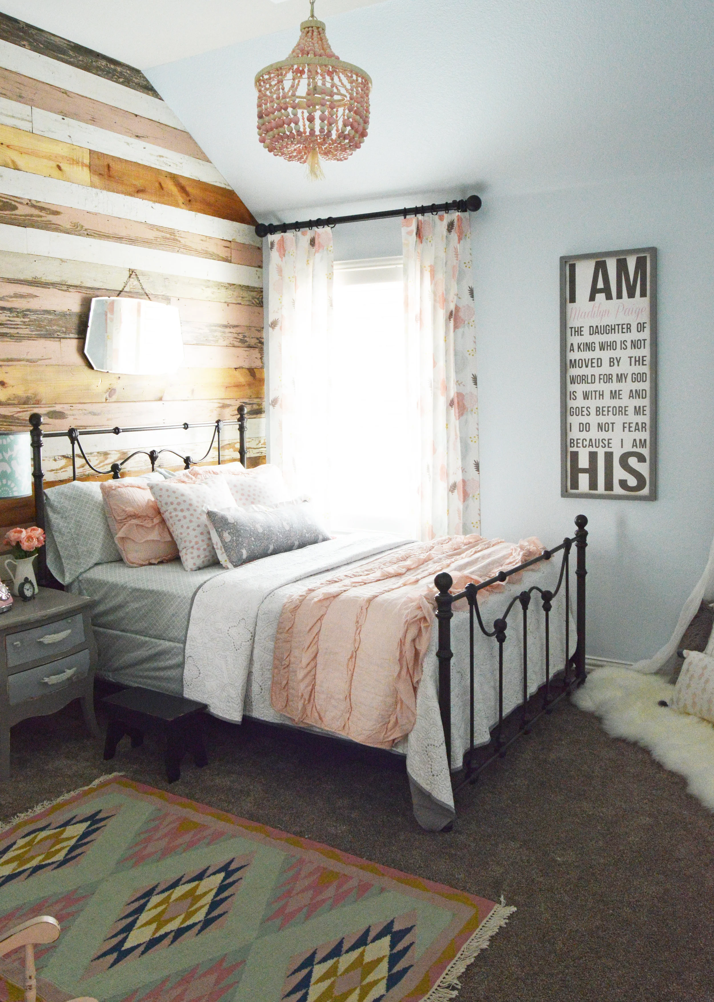
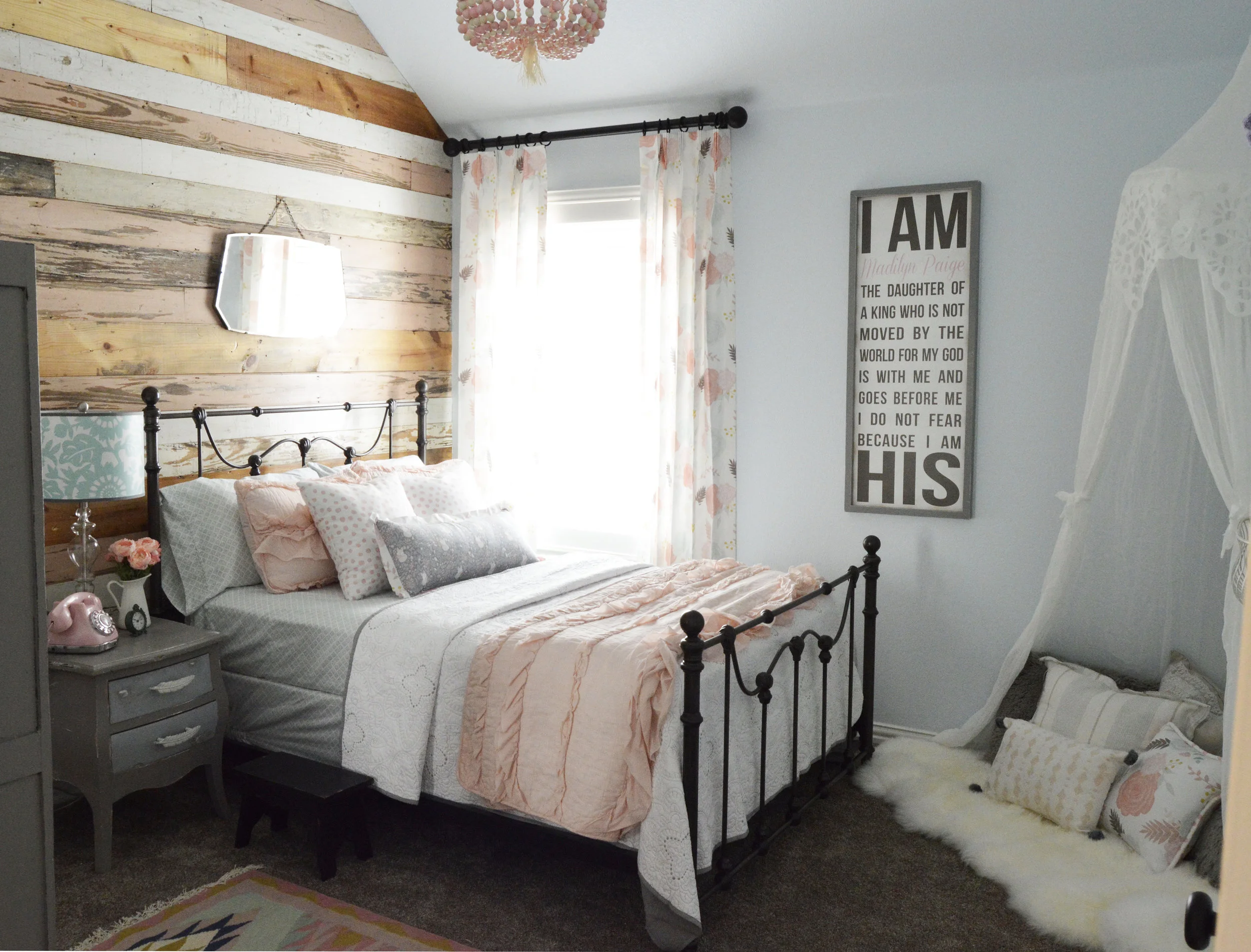
I recently completed a bedroom for Madilyn, the adorable daughter of one of my clients, and it brought out the pink-loving little girl in me that I've suppressed since childhood. (I was the girl that had a MEGA barbie house taking up half my room, and at one point, over 100 barbies.)
Madilyn made the big transition from a crib to a toddler bed and now needed a "big girl' room to match. Her mom wanted a room that was feminine with an antique and vintage theme, but also a room that could transcend and grow with her daughter's age: nothing overly juvenile or childish.
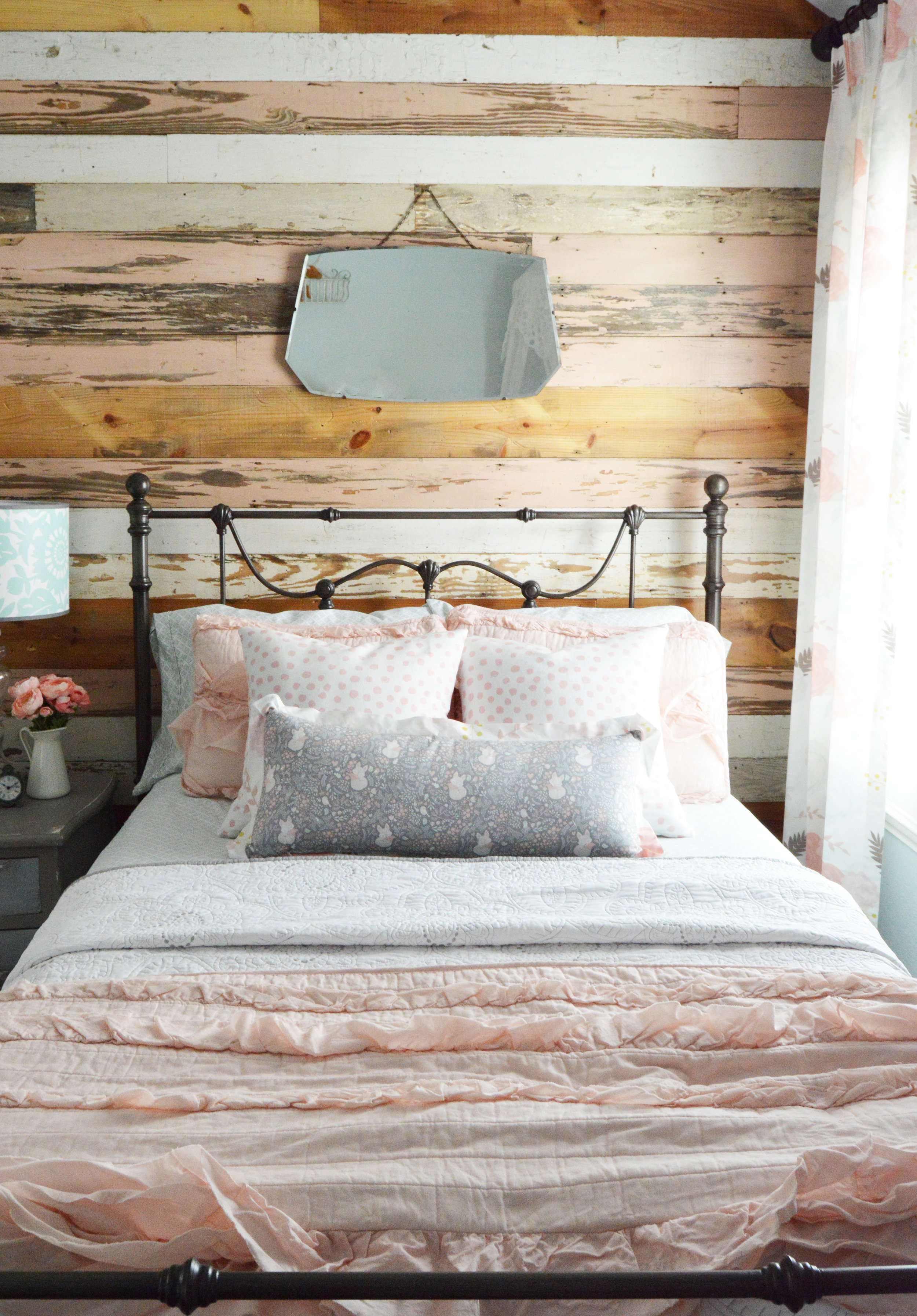
Pink had to be a big part of the room. Duh. But not barbie pink or unicorn vomit pink. Blush pink. Light, fluffy, pretty blush pink. Like many of the bedrooms I design, this one started to come together as soon as I found the curtain fabric. It set the color scheme - mint, blush, cream, and grey - and overall feel.
Isn't she pretty?
Feminine, but not girly. Right? No neon, or primary colors, no Fisher Price toddler crap. No glitter, sparkles, or tiaras.
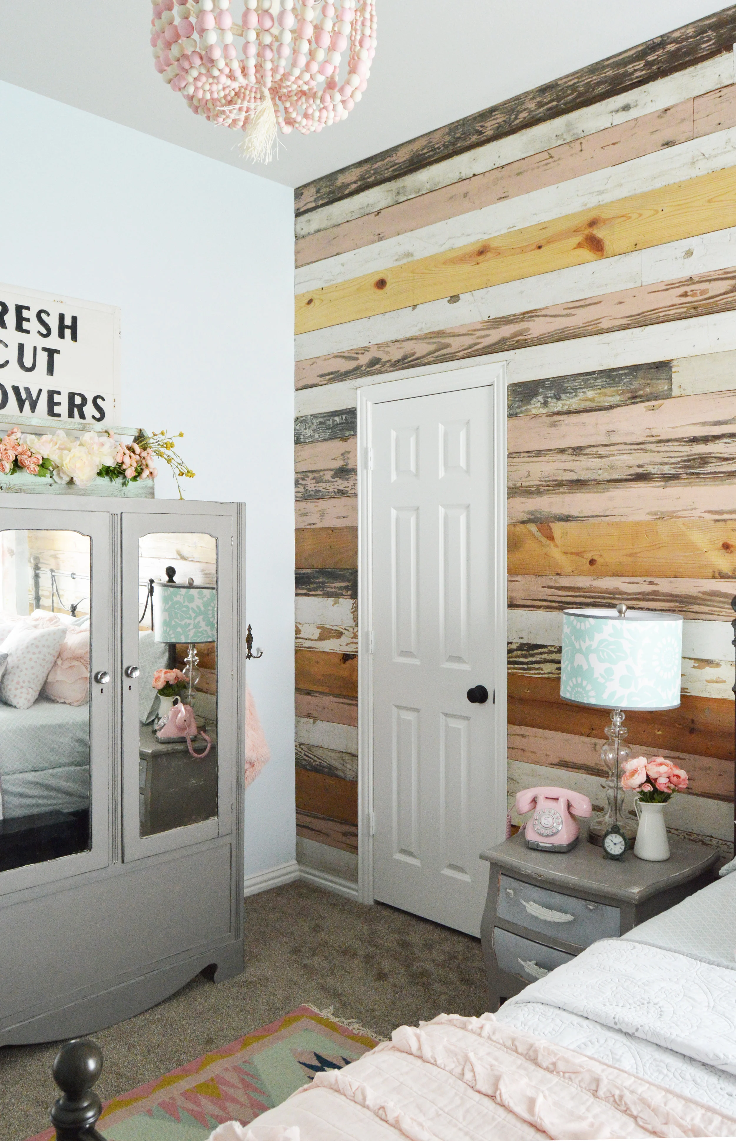
The focal point of the room is the wall. Those boards are antique reclaimed wood. I saw a few pink boards at Old Texas Wood and begged them to find as many more as possible. As always, they came through. The pink boards are mixed in with some natural, wide plank boards, some weathered grey boards, and distressed white boards. I absolutely love the end result.
I know how much my toddler loves seeing her name written down, so I wanted to make sure to incorporate Madilyn's name in the room design. The customized tall wood "I AM HIS" sign was created just for her by the Etsy store, Pretty in Polka Dots. I loved it so much I've already ordered a different piece from this store for another client.
The vintage mirror above the bed came from another Etsy store, Flicker and Sway. Talk about good packaging! I almost needed a chainsaw to get through all that bubble wrap.
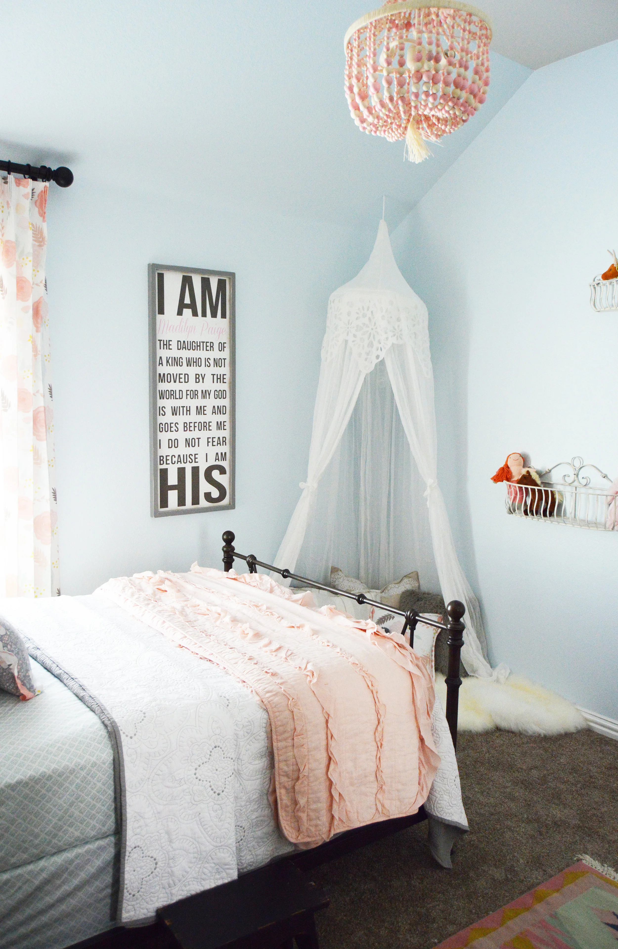
I didn't want to take away from the beauty of the boards, but the walls were a plain light grey, almost cream color so we painted them Sherwin Williams "Sky High". It's a little bit bluish, a little bit minty and so so pretty.
Where is that ridiculously cute beaded chandelier from? Well I'm glad you asked. You can find that little guy at Pottery Barn Kids. I also bought the soft sheer canopy from there. Madilyn already had a pretty awesome play room, so her mom wanted to keep most of the toys out of her bedroom. In place of a toy chest or desk area, we opted for a cozy little corner where she could cuddle up and read a book or play with her stuffed animals.


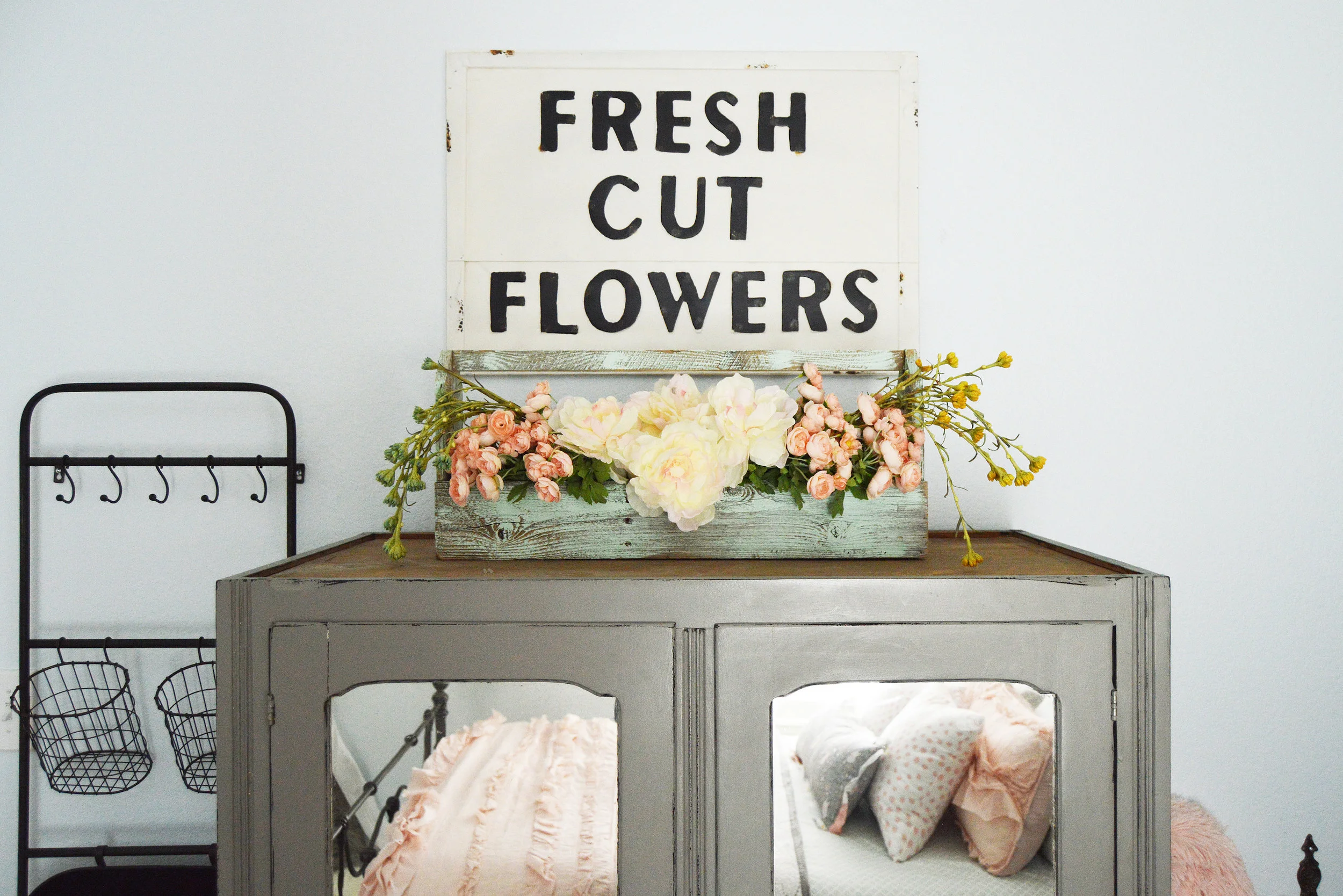


I scored this pink little rocker and distressed mint tool box (now a floral display) from the Canton flea market. $25 for both. Um, yes.

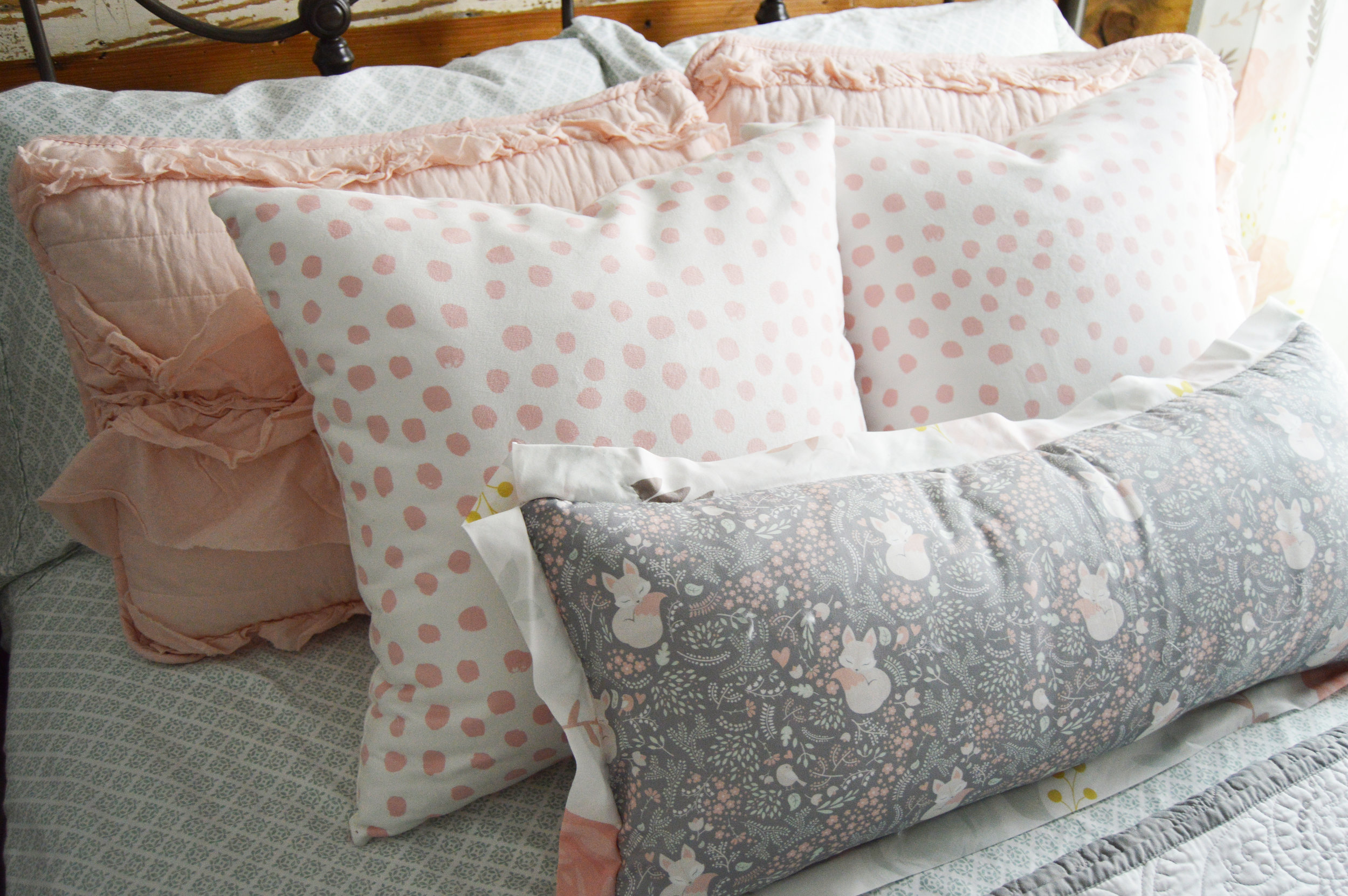
The sheets and white quilt are from Target and the pink coverlet and bed frame are from Wayfair. That really, really awesome rug? Lulu and Georgia. I had the pillows and drapes custom-made to create a cohesive and well-rounded pattern and color scheme with various textures and shapes.
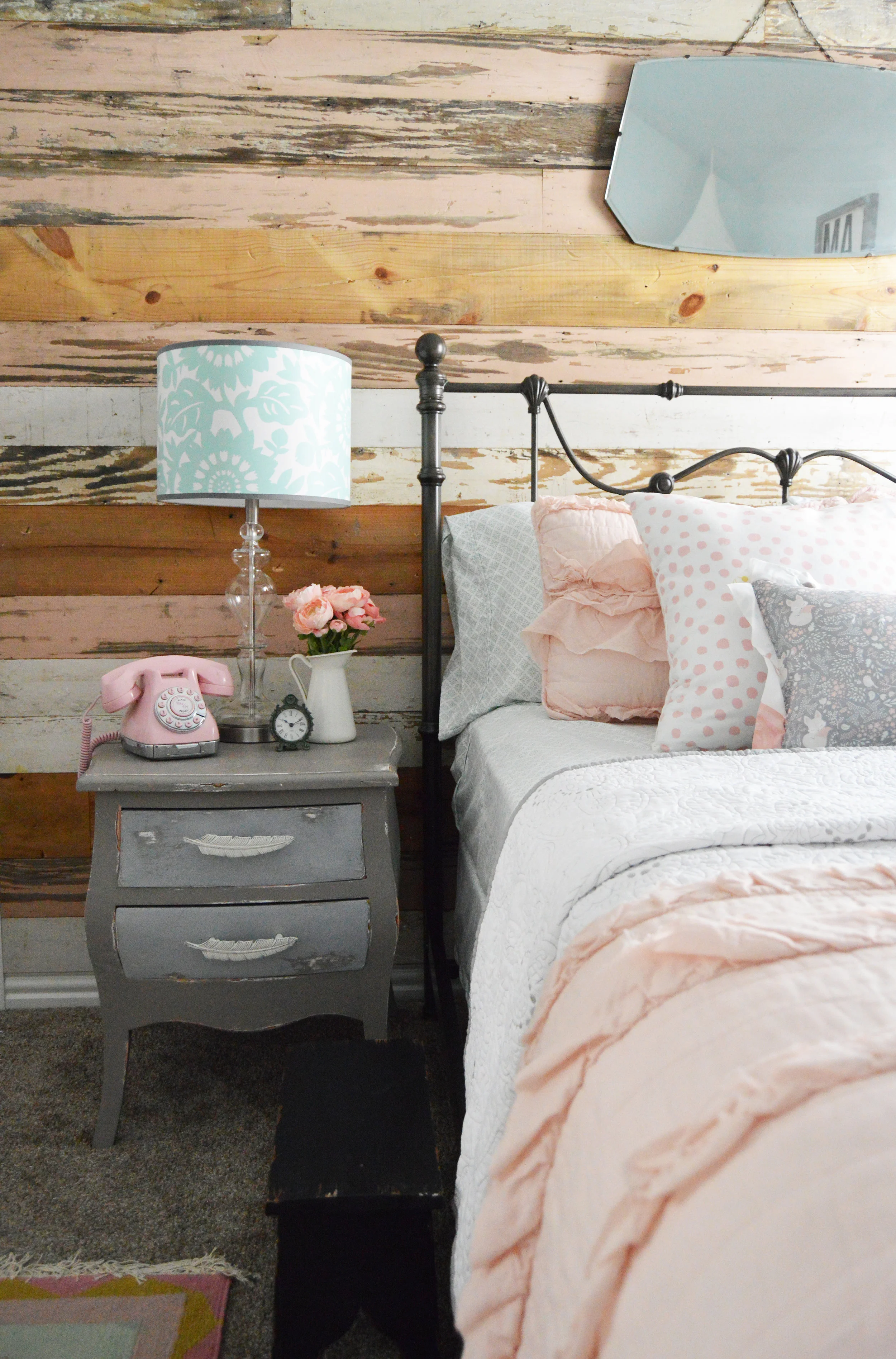
I searched and searched and searched for a nightstand that would be perfect. It couldn't be too fussy next to that wall, but it needed to have some charm and character. I finally found this little french provincial nightstand (and that black step stool) at a local antique furniture store. The original hardware was, well, ugly. So, I did something many of my colleagues may scoff at: I replaced antique hardware with Hobby Lobby hardware. Whaaaaaaaat?!
The vintage pink Mary Kay telephone is from eBay and the little vase and flowers are from the great Ikea. The lamp and base are from Lamps Plus. They don't have that exact shade anymore, but I linked one that is pretty darn close.


There you go. Hands down, one of my all-time favorite rooms to-date.
The Top Nine: Where I Shop as an Interior Designer
"What stores do you shop at as an interior designer?" This is the numero uno question I get from clients and friends. Unfortunately, the simple answer is ...
"What stores do you shop at as an interior designer?" This is the numero uno question I get from clients and friends. Unfortunately, the simple answer is: Everywhere.
End of blog post.
...
Just kidding. The more complicated answer is that several of my regular stores are not open to public and are "to the trade"/certified professionals only. This basically means I get pieces straight from wholesale and then resell them to my clients at a discounted price from their MSRP (manufacturer's suggested retail price) -- resulting in a win-win for everyone.

Yada yada yada, right? That doesn't help you know where to get a rockin' new area rug. So, now that we got all that boring detail out of the way, I'll share my go-to retail stores. These are regular ole retail that have either great prices, awesome quality, and/or unique pieces (and some even have all three of those! #winning).
Here are some of my favorite retail stores in nine primary home decor categories.
FURNITURE:
Joybird - Mid century modern, affordable, GORGEOUS, and well-made. I.LOVE.THEM.
Wayfair - They have pretty much anything your heart desires at a huge range of prices. I work with them a lot and their customer service is one of the best.
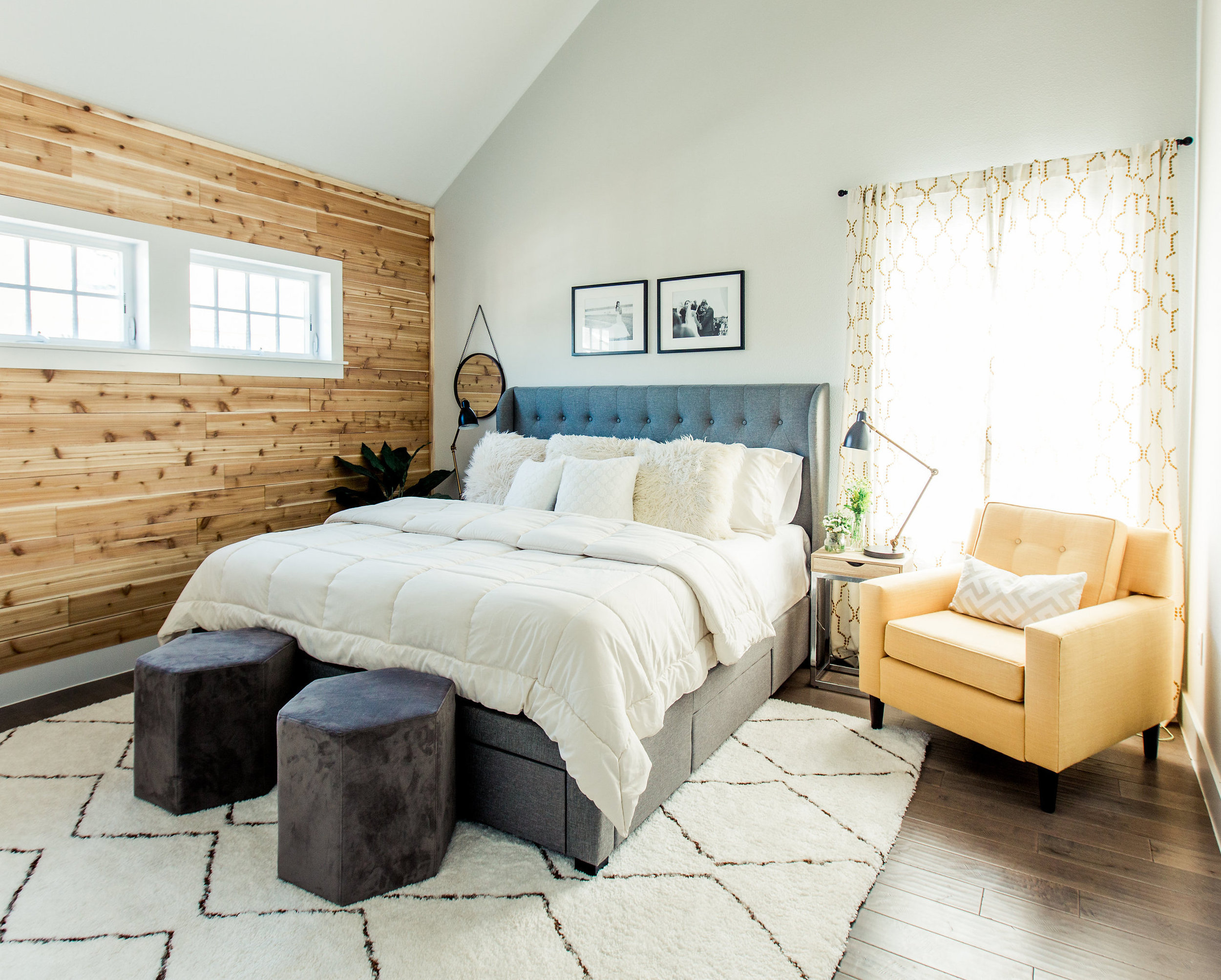
The bed, side tables, and side chair in my Urban Rustic Retreat project all came from Wayfair.
Bassett - A little pricey, but you can customize each piece with so many fabric choices and they have a really killer selection of pieces.
LIGHTING:
Shades of Light - Oh man. I use them all the time. They have A TON of options in all styles, ship so fast, and have fairly decent pricing.

Hanging side lamp in this Romantic Master Bedroom project is from Hangout Lighting.
Hangout Lighting (Etsy) - They have some really interesting, modern, and industrial handmade lighting options. Price points are really good.
BUILDING MATERIALS:
Floor & Decor - I used them for all my home renovation materials. They carry most of their inventory in stock which means you can pick it out and take it home the same day. Prices are competitive and they have a thousand percent better and more options that Home Depot or Lowes.
Old Texas Wood - This is a newly discovered favorite in southeast Dallas. They have a huge warehouse of reclaimed antique wood floors and barn wood from all over the U.S. and can do the install for you as well. AND their turnaround time is, quite frankly, unmatched. Like within a week. WHAAAAAT??
Here's a little teaser for my "coming soon" feminine toddler room reveal. The wood wall is from Old Texas Wood. They scoured the warehouse and lumbar yard for me when I asked for pink boards :)
FABRIC:
Spoonflower - They have so many fun (and by so many, I mean THOUSANDS) patterns in nearly every color combination. I could browse for hours. Want dancing unicorns? Got it. Llamas wearing beanies? No problem.

Spoonflower fabrics from my Cedar Hill nursery project
PRE-MADE CURTAINS:
West Elm - They have both classic and modern patterns and ship quickly. Fair prices.
Urban Outfitters - More whimsical and bohemian style.
DECOR:
Hobby Lobby - Yep. Good ole Hob Lob. There hasn't been one single install that I wasn't at Hobby Lobby the day before, stocking up on all their random crap goodness. Their decor accessories are so stinking affordable.
Homegoods - While the messiness of these stores look like my child's bedroom and frustrate the hell outta me, they have insanely cheap prices and I rarely walk out of there empty-handed.
At Home - Throw pillows. Rows and rows of fluffy goodness.
WALLPAPER/DECALS/WALLCOVERINGS:
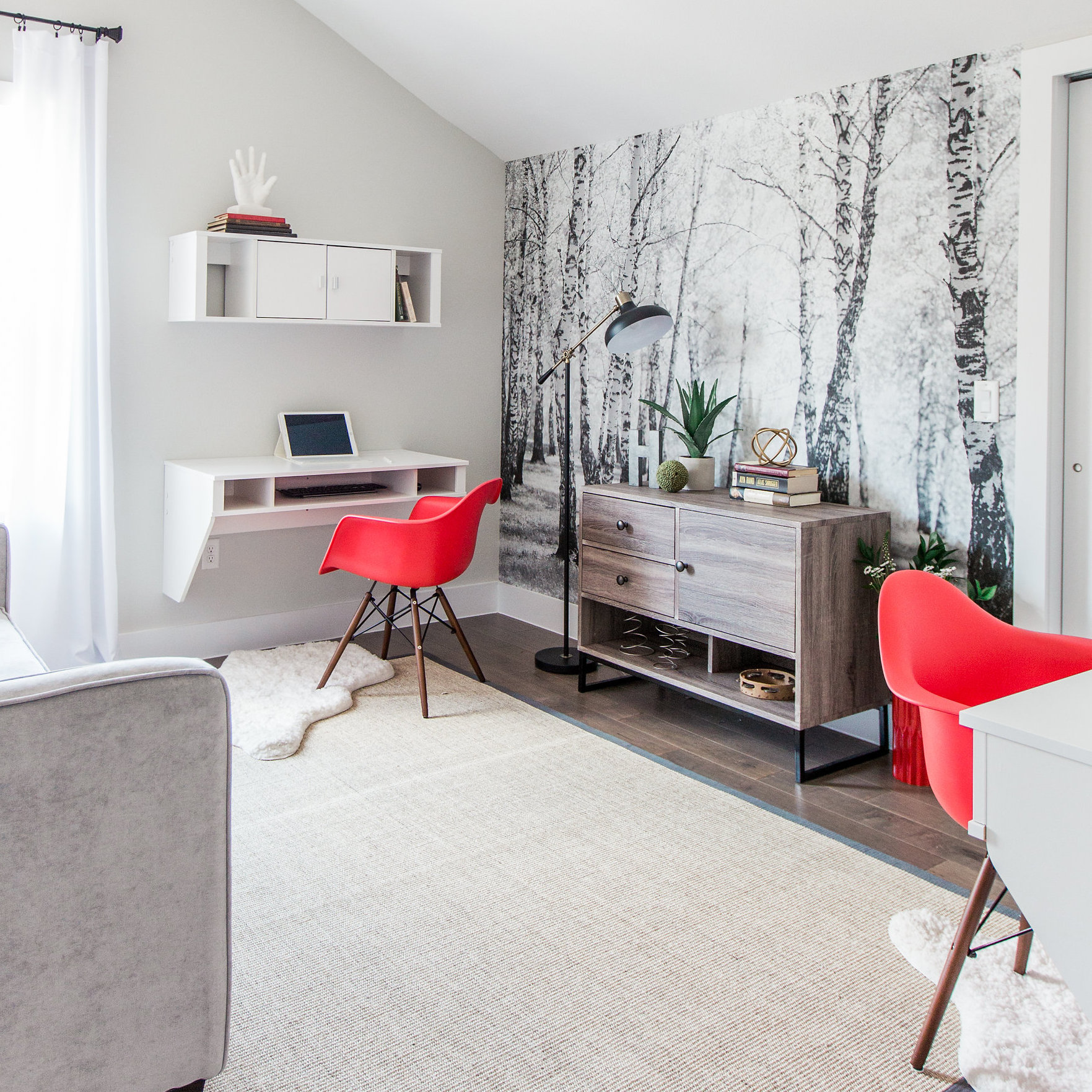
The black and white forest mural in my Urban Rustic Retreat project is from Murals Your Way.
Walls Need Love - Not a huge selection and a bit pricey, but modern and colorful. All their options are for removable wallpaper (which is REALLY easy to install by yourself).
Spoonflower - Everything I said above about their fabric options? Yep, they all come in wallpaper too. Removable or glue backed.
Murals Your Way - GREAT prices. Removable or glue backed, and you can use your own photos to make a mural.
Anewall - Their wall coverings and murals make me drool. Like water dripping from the mouth drool.
RUGS:
ECarpetGallery.com - I get asked A LOT where I get my persian rugs from. This is the answer. They sell on ebay too which is how I get their lower or sale prices.
RugsUSA - Great prices, large selection of styles.
Lulu & Georgia - They have a really unique inventory of rugs. Every heard of modern southwest? Whimsical southwest? Or tribal patterns with colors like blush and mint? Yea. They have it. (Good prices too)
ART:
Minted: I love using Minted because it directly supports the artists, but has a large selection of paintings, drawings, charcoals, photography, etc. Really beautiful stuff and good prices. They offer frames for their pieces too, but I don't recommend them. A bit cheap looking.
Zgallerie - This is my go-to for inexpensive but expensive looking artwork. Large inventory and the stores carry most of their inventory in stock. Their frames are a little dingy too, so you you often have to find one that's not dented, but the selection of art and cheap prices make up for it.
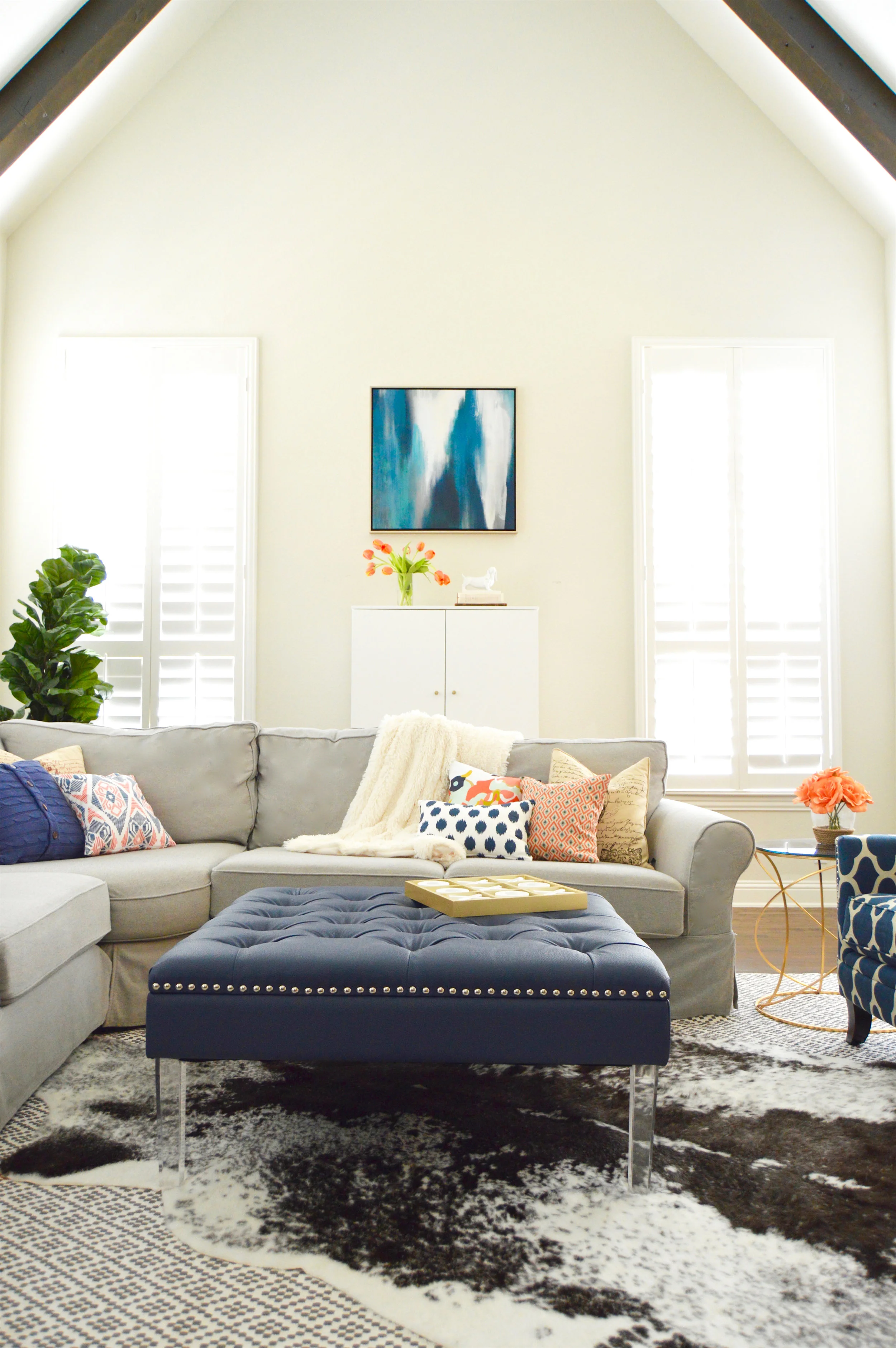
Bought this little blue abstract gem straight from ZGallerie the day before the install on this Frisco living room project.

That's it. All my favs wrapped up into one little (actually ridiculously long) blog post. Hope that was helpful in all your shopping endeavors!
...By the way, none of these are sponsored or anything. I really do just like these stores.
Urban Rustic Retreat: Bishop Arts Project Reveal
Dallas' Bishop Arts district.
It's a place all the 20's and 30's somethings are dying to live, having become widely popular in the last few years thanks to it's unique art scene, restaurants, ridiculously cute historic houses, and close proximity to downtown Dallas. It's the type of place that simply makes ...
Dallas' Bishop Arts district.
It's a place all the 20- and 30-somethings are dying to live, having become widely popular in the last few years thanks to its unique art scene, restaurants, ridiculously cute historic houses, and close proximity to downtown Dallas. It's the type of place that simply makes you "cool" by association. The type of cool that rivals those of us living in suburbia.
Ok, maybe not that last part. My delusions of grandeur for my 80's house in the 'burbs sometimes slip through.
I digress.
All of these things made it the perfect place to call home for some of my clients. They own a fast-pace, long-hours business in uptown and, quite frankly, work their little tails off. Their design goal was pretty straightforward: create a retreat with bright clean lines and little rustic nod.
Alrighty, enough talking. Picture time! Oh, and thanks to the incredibly talented Britt Latz photography for these photos. Because, really, I'm only as good as my disposable camera.


That Thing I Always Said I'd Never Do.
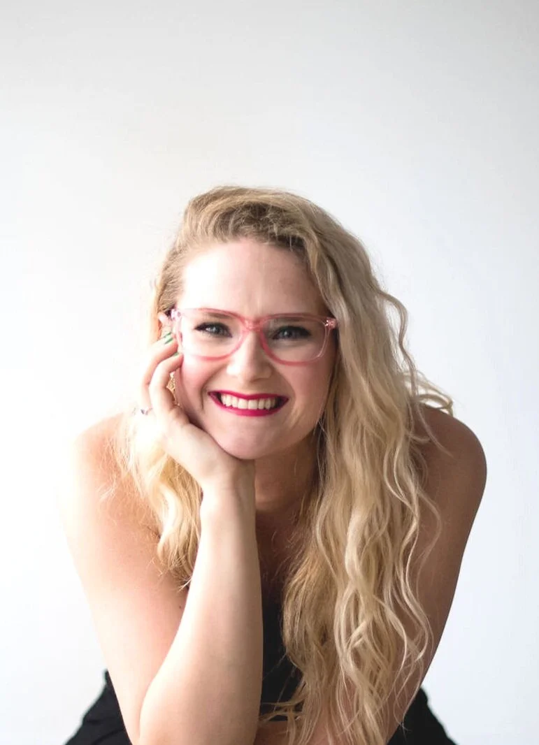
Hi there reader. I'm Brett, owner and designer for Brett Nicole Interiors.
I feel like an explanation for this blog is in order, so off we go.
Constant designs, ideas, inspirations, and dry humor are always floating around in my blonde little head and ...

Hi there reader. I'm Brett, owner and designer for Brett Nicole Interiors.
I feel like an explanation for this blog is in order, so off we go.
Constant designs, ideas, inspirations, and dry humor are always floating around in my blonde little head and I have no where to put it all. Facebook and Instagram aren’t enough, and Snapchat is, well shoot, I don’t even know how to use Snapchat.
I racked my brain to figure out a place I could put all this ever-so-useful information. And so, I did what no one else has done before. The first of its kind, really.
I started a blog.
Me, Brett. Posing awkwardly as my husband tries to get one of those super cool bloggy-type effortless photos. (They are definitely NOT effortless.)
I know. You can't stand it, you're so excited. Me too. Everyone who knows me knows how much I like to talk, tell a story, or share what I'm thinking. This is totally up my alley.
Just kidding. That was my husband I was describing. Me, on the other hand, well, my idea of a good story or article lasts for no more than 100 words, shoots high, tells the facts, and then lands that plane asap. In other words, I don’t like fluff. I like getting to the point, and of course, the occasional witty remark that you mentally pat yourself on the back for.
So, folks, here’s the introduction to my blog. It’ll be a lot of pretty design pictures (mine and otherwise), projects I’m working on, a few “how-to’s” for all you crafty DIYers out there, answers to questions I often get, and some super secret interior design tips that you could not find anywhere else (except google).
Enjoy.
(I think this is also where I’m supposed to say thanks for following, but that seems weird, so … over and out).
Brett
Welcome to the blog.
Brett here.
I’m a little blunt, supposedly sarcastic, and I easily get off topic. But boy do I love design and I sure love talking about it. So here you go.