The slightly weird, potentially sarcastic, not your average interior design blog.

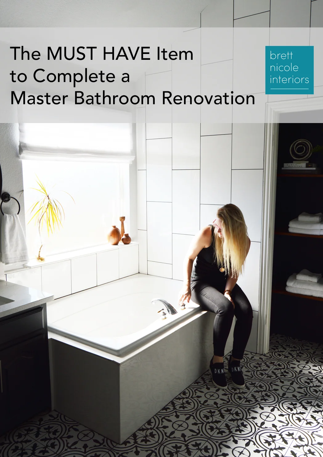
The MUST HAVE Item to Cap Off A Master Bathroom Design
But honestly it still didn’t look or feel finished. While beautiful, it felt a bit cold and dare I say (don’t you dare quote me on this) a little TOO sleek and polished. It needed to reflect my family’s personality and lifestyle.
And my style is a bit like a …
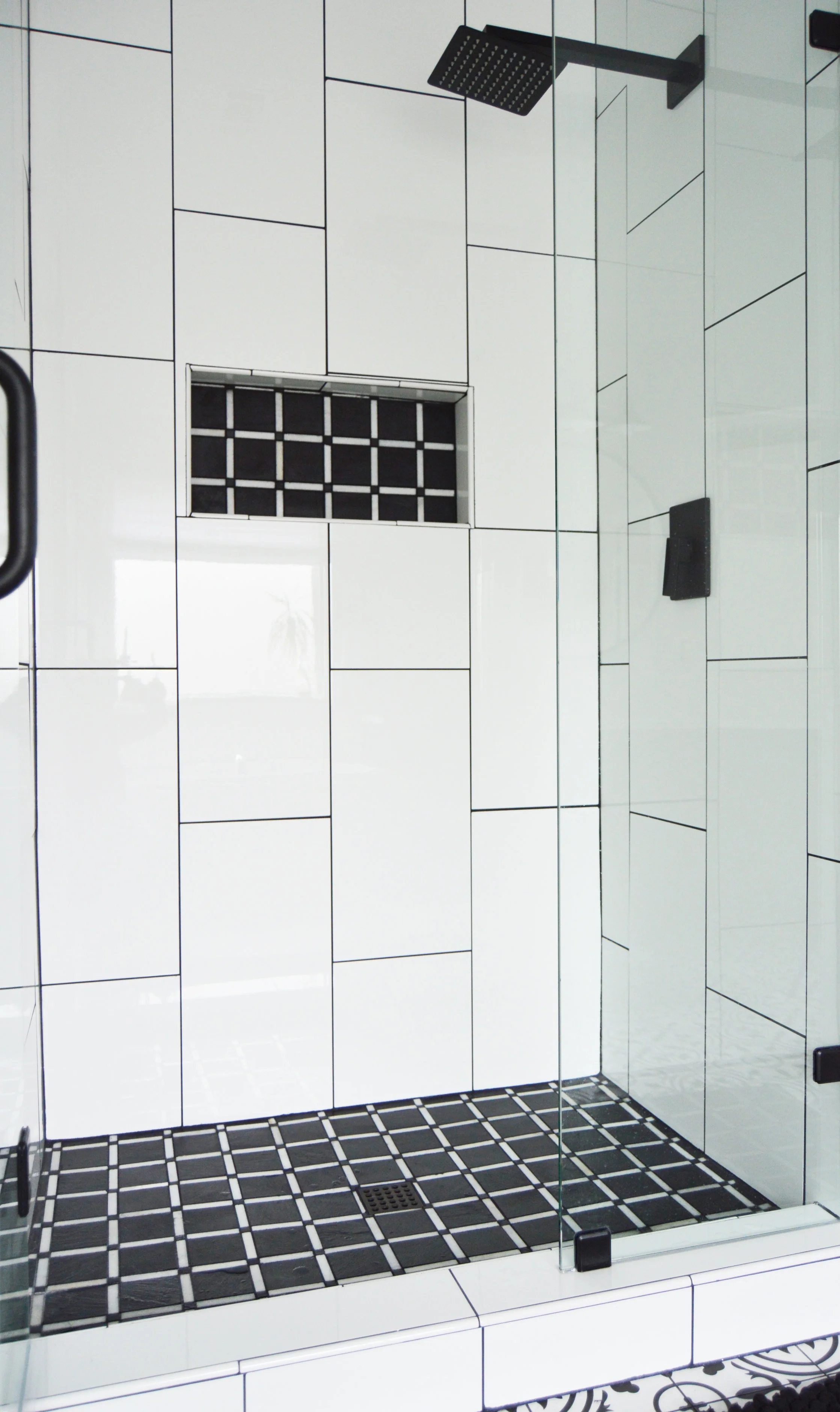
The tile is laid, glass shower door in, walls painted, and counter tops installed. I bought new towels, mirrors, and lights, and a fluffy black bath mat. I stewed over this design for several weeks, finally ending up with my first choice: white and black color scheme, minimal polished white wall tiles against a busy and whimsical floor tile, all tied together with a fun but modern shower floor tile and niche.
But honestly it still didn’t look or feel finished. While beautiful, it felt a bit cold and dare I say (don’t you dare quote me on this) a little TOO sleek and polished. It needed to reflect my family’s personality and lifestyle. We’re the type of people that have on a tailored blazer and blouse on a video conference call, with llama’s-in-party-hat pajamas underneath.
My style is a bit like a mullet. Business in the front, party in the back.
In summary, I needed to turn my gorgeous sleek bathroom into a mullet. I probably could just end my blog post right here and also file that under the “things pretty much no designer has ever said” category.
—
My bad. I’m totally spiraling down a hyperbolic rabbit hole. I’ll reign it in.
So I didn’t want to add too much crazy to the design, but the bathroom did need something to make it much more inviting and cozy. And that leads me to: THE MUST HAVE ITEM to cap off a master bathroom design.
A quality, custom window dressing.
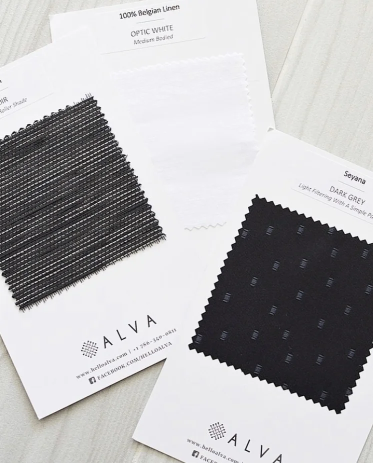
For the past four years or so, I’ve ordered my client’s window coverings from a local showroom. But that comes with a big price tag. Recently I had heard of a new all online (which keeps pricing much lower) custom window covering store called Alva. Their products looked gorgeous and I was excited to try them out on my bathroom project (especially since you can get as many free swatches as you want!). I ordered about 4-5 swatches, and then narrowed it down to 3. The two photos below were my inspiration photos.

Minimal, black roller shade inspiration.

Soft, flat white roman shade inspiration.
There are so many different types of window dressings out there. And most people don’t know the difference between any of them (thesis strongly supported by the regular eye rolling back in the head by clients when I bring up their different window options). Case in point: a zebra shade vs. solar shade. Or pinched pleat drapery panel vs. inverted pleat drapery panel. Roller shade vs. roman shade. Wood blinds vs. vinyl blinds. Grommet top vs. ripple fold. Cascade roman vs. flat roman.
Are you asleep yet? Because I could seriously rant on for another 15 minutes, listing the different types and when to use each of them. But I won’t, so you’re welcome.

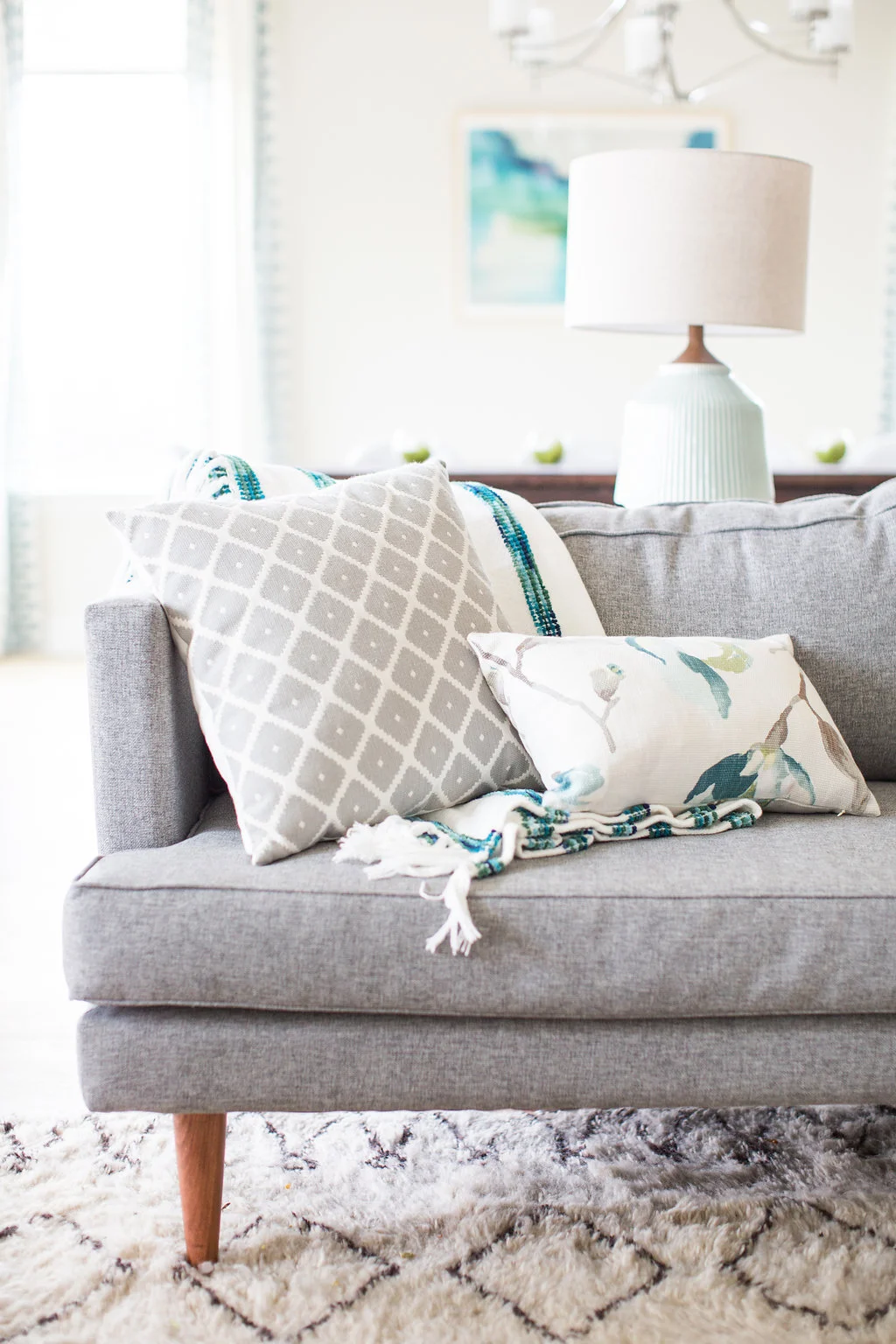
I’ll just explain why I chose what I did for this space. Since this is a bathroom, clearly I didn’t want drapes. They would puddle down right into my bathtub…which would be downright weird. While privacy vs natural light is typically the deciding factor for what type of window shade in a bathroom, for my bathroom privacy wasn’t an issue since my window has full texture for complete privacy. So for me, the main concern was just aesthetic.
I had to decide between black, minimal, modern roller shade and a soft linen roman shade.
In the end, I decided on the “Optic White” Belgian linen flat roman shade. I really wanted an option that softened the high polished tile right next to it.
To order, I just had to take a few super easy measurements (window width, height), pop them into Alva’s website and submit the order. It was a really quick turnaround of about two weeks and installation took me maybe 10 minutes…by myself! Well. Okay, no it didn’t. I may have sneezed, slipped in the tub and my butt hit the tub faucet. Water pours out. Brett’s leg and foot get soaked. Life moved on. But that fiasco aside, it took 15 minutes. Just trying to paint you guys the full picture here.
Y’all. It completely softened the entire space and gave it a cozy, lux feel. And the fabric is so so so so pretty.

I opted for an outside mount (mount sits on the outside of the window instead of in between) to get the fullest effect of the linen. And while roman shades come in a variety of options in regards to their fold, I chose a flat roman. It’s typically the most modern version of a roman and gives a clean-lined, tailored look.

It’s been a long month. Our wallet is empty. Our house covered in construction dust. But wowee do we have a pretty view from the squatter (that’s a toilet for you fancy folk). I’m still in the “oh my gosh don’t leave a speck of dirt on any surface” post-renovation phase, but that will soon end. Our master bathroom renovation turned out exactly how we’d hoped. Now on to the the next project…

Full Reveal of My Modern Bathroom Renovation + 4 Tips For Where To Splurge and When To Save
Well, the bidet works. I definitely just laughed out loud and may even have snorted a little as I sit here writing out what happened to …

Well, the new bidet works.
I definitely just laughed out loud and may even have snorted a little as I sit here writing out what happened the other day at Easter.
My eldest sister, Erin, (who, mind you, has a genius IQ) was in the middle of her tour of our new master bathroom when she apparently didn’t know what the little knob on the side of the toilet was for. So of course, she bent over to look at it and twisted the knob. All.The.Way.
Helloooooooo old faithful. And a toilet-water soaked sister.
And then there were three of us on the sidelines. Pretty much dying of laughter. And definitely not helping her.
—
That said, our bathroom is finally done. It was one of my top spaces to renovate when we bought this fixer-upper. The peach, gold, beige, and brown 90’s decor vomit just wasn’t doing it for me. Shocking, I know.
So here was the reno plan: replace floor tile, get new countertops, paint walls and cabinets, tear out existing shower insert and tile it, tile the entire back wall, and few new finishes and smaller items like mirrors, lighting, toilet, and shower door. Now, if I lived a perfect world, this bathroom would also have had a new freestanding bathtub, custom vanities with a boatload of more storage, and we would have expanded the footprint of the shower (Lord knows I love a LOOONNNGG shower where I pretty much just plop myself on the floor and sit right under the shower head).
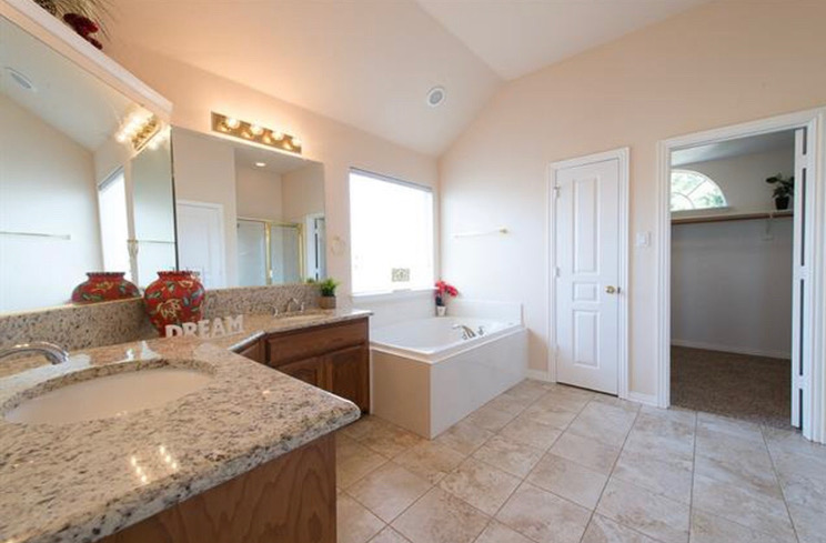
A “before” picture from one of the real estate listings.
But alas, my world is far from perfect (and I quite prefer it that way - perfect is boring). In this case, our budget was way lower than I would have liked since our timeline for completing this project was bumped up by about a year. We weren’t planning on tackling the bathroom update until next summer, but our foundation decided to give out last fall and caused a ton of leaks upstairs in our bathroom … leaking all kinds of gooey brown disgustingness and smelly water all over my kitchen and dining room. From there, it was just a slippery slope of one “small” fix to doing a complete renovation. It started with our shower pan that was cracked and leaking, but the shower was a cheap ‘ole 90’s insert, so the whole shower had to be torn out. Other than that, there were no other “real problems” in the bathroom that we knew about. But OF COURSE you’re thinking, why do all that work to redo the shower and not fancy up the rest of the place?
Me and you, we’re on the same page.
And so we redid the whole bathroom. I wanted it to feel bright, light, slick, and modern with just a hint of whimsy and fun. The rest of my house has been updated to a modern eclectic aesthetic, and the bathroom needed to be cohesive. But, it also had to be good for resell, so no super polarizing choices.
Here is all the shiny white and matte black goodness…


I decided to take the wall tile all the way up to the ceiling and expand it across the back wall. The bathroom has unique angles and a tall ceiling so I wanted to show off its assets. To bring your eye up and make the room feel more grand, I had the tile laid in a vertical brick rather than your standard horizontal brick pattern. So that the grand wall of tile wasn’t jarringly white, I used a contrasting black grout, and carried it throughout the floor and shower floor tile as well. Though, to be honest, I also did black grout because I have a thing with white grout. The thing is that I hate it. White grout is so impractical in an area with soap, scum, and moisture — making it impossible to keep it looking clean. It’s like the equivalent of wearing white pants when you’re the mom of a toddler. STOOO.PID.


I removed the door on the linen closet, painted the inset black and gave it some wooden shelves to give it a more modern, edgy look (and there were just too many doors in this small of a space). The oversized mirrors had to go, and were replaced with simple 38” black framed round mirrors. We added a few white lacquer uppers to the middle of the vanity for additional storage, and I specifically chose lacquer to mirror the polished white on the wall tiles.
Overall, I love how it turned out and I’m not sure I would have done anything differently.
And since we were on a tighter budget, there had to be places we splurged and places we needed to save. Here were my top four:

SAVE: Sink faucets. We were planning on salvaging our current faucets, but they got cracked when they were removed. So, I got these cute little vintage-looking ones for ONLY $32/each! While I wanted to go matte black to match my new shower head, the bathtub hardware had to stay put (and is ugly chrome and gold), so I needed to find faucets that married the tub fixture with the shower fixture.
SPLURGE: Shower head and knob. This 8” square matte black fixture was a pretty penny at a little over $300 and worth every cent. It shoots out water at just the right pressure, looks gorgeous, and makes the shower “experience’ feel lux. Seriously. Makes me feel like I’m in one of those weird tropical Herbal Essences commercials (and don’t pretend you don’t know exactly what I’m talking about). Who wants to completely update your bathroom and then have your cheapo shower head spit on you like a dainty southern woman. No way jose.
SAVE: Wall tile. I tiled the shower walls, plus the entire wall next to the shower. And while my contractor pretty much hated me for it, it turned out spectacularly gorgeous and is definitely a “WOW” factor. That said, it was a lot of square footage to cover and would have completely broke the budget if I picked a pricey item. The tile I chose was only about $1.75/sq ft! It’s a high polished white ceramic 12x24.
SPLURGE: Shower floor tile. There’s only a tiny amount of square footage to cover here, so splurge away! Adding a super fun pattern or splash of color to your shower floor and niche is a really great and affordable way to give your bathroom a unique and custom look. The plaid slate mosaic I chose was about $10/sq. ft.
3. SAVE: Keeping existing cabinetry and painting them instead. I don’t love the look of my cabinets but it was just not in the budget to get new ones. So I painted them black to minimize the dated curve that the cabinet has, and it definitely gave them new life.
SPLURGE: New countertops, ESPECIALLY if you can’t get new cabinets — they will completely and immediately update the space. I opted for a clean white quartz with a slight grey speckle. I love veining in quartz, but it would have been too busy with my floor tiles. Quartz is a killer option for bathroom countertops and is nearly indestructible. Quartz pricing is all over the place, based on thickness, veining, etc. My slab cost about $1,000 which, while a splurge for this bathroom and budget, is actually quite low for new counters.

4. SAVE: Labor for low-skill projects. We opted to DIY the wall painting and demo-ing the previous tile floor and baseboards. Both these projects saved well over $1500 - $2000 worth of labor and took us two days to complete. The skill level needed for these was very low which is why we felt like we could just tackle it ourselves.
SPLURGE: Labor for drywall, properly waterproofing the shower, laying tile and grouting. The numero uno cost in a renovation is labor, NOT materials. And honestly, it should be. Let the professionals do the things that need to be professionally done aka DON’T CUT CORNERS. (If you’re in the DFW area, I highly recommend Agape Home Services!)
—
All in all, the renovation took about one month from start to finish, cost a total of $17,000, and, in my opinion, totally transformed the space from peach and dated to bright, modern, and fresh. Comment below on your thoughts!
Next week I’ll be sharing with you the one item that is often forgotten in a bathroom design that is a MUST HAVE. Hint, it debuts a few times in the pics above as a sneak peek, but you’ll get the full scoop next week!

California Modern: Golf Club Drive Project Reveal
So, I'm feeling feisty-er than normal today.
It's raining outside and I'm still in my PJ's because I've been in front of my computer all morning, balancing my books, and sending invoices. I can’t believe people love doing that stuff for a living. God bless you. For …
So, I'm feeling feisty-er than normal today.
It's raining outside and I'm still in my PJ's because I've been in front of my computer all morning, balancing my books, and sending invoices. I can’t believe people love doing that stuff for a living. God bless you. For real. God.Bless.You. (and QuickBooks).
I have Norah Jones playing in the background which is normally quite relaxing for me, helping me to focus, but I guess she decided to dabble in some R&B type mixing? Seriously. Girl, don't. It's just weird. So now I’ll just switch it to my all-time favorite, Etta James. Now that woman never disappoints.
Someone recently told me they liked my writing because it was very much "train of thought" writing. I thought that was pretty funny, because, well if you really knew how my mind thinks and processes, it'd be like watching a bunch of chickens try to play the game Twister.
…
I seriously digress.
Golf Club Drive Project. The long-awaited reveal is here. This is a project I completed a while ago and the pics have been plastered all over my facebook and instagram for a while now. And (spoiler alert) all my favorite images are already on my portfolio page.
This was such a fun project to work on. My clients are Toyota employees and moved here from LA when Toyota decided to plop it’s headquarters here in Plano. The home was a new custom build so we got to start from scratch with most of the details. The clients wanted a fresh, modern, clean home with bright splashes of greens and blues and little hits of rustic. They also have two young kids so of course, it had to be kid-friendly first and foremost. Their style bordered between modern scandinavian design (clean simple lines, neutral colors, takes cues from function and minimalism) and rustic modern (raw, distressed wood with neutral colors and cozy textures). In the end, I themed the design “California Modern.”
This project covered the entire home: foyer, their son’s bedroom, daughter’s bedroom, home office, study, open-concept living/dining/kitchen, master bedroom, and playroom. We didn’t move around any walls or mess with the structure; the project consisted primarily of new furnishings, drapery, paint, and wall coverings The budget was around $100,000 and the project took approximately five months to complete.
When you walk in the front door, you enter the foyer. We wanted this to be uncluttered and bright, with an interesting piece of furniture. This console table was the perfect size and style, with its rustic worn wood, and unusual sloped design.

If you keep walking straight, you’d go in to the open concept living space: living room, dining room, study, and kitchen. The challenge with these types of spaces is that while the open concept space had to be cohesive in design, every space needed to have a specific purpose and its own unique design.

LIVING ROOM
1.) Sofa and teal chair: Joybird; 2.) Coffee table: Living Spaces; 3.) Custom upholstered arm chairs: Bassett; 4.) Drapery panels: West Elm; 5.) Natural wood roller shades: The Shade Store


DINING ROOM
1.) Dining table and bench: Restoration Hardware; 2.) White plastic dining chairs: Wayfair; 3.) Wall art: Minted; 4.) Drapery: West Elm; 5.) Wood roller shades: The Shade Store; 6.) Buffet console: CB2; 7.) Lamps on buffet: West Elm


STUDY
1.) Paint: Sherwin Williams “Quietude”; 2.) Desk Chairs: West Elm; 3.) Wall art: Hobby Lobby; 4.) White solar roller shades: The Shade Store; 6.) Rug: RugsUSA; 7.) Custom Upholstered Chaise: Bassett


Stay tuned for another blog post where we’ll reveal the master bedroom, two kids’ bedrooms, home office, and the playroom!
—
Photography by: Jen Burner Photography
Welcome to the blog.
Brett here.
I’m a little blunt, supposedly sarcastic, and I easily get off topic. But boy do I love design and I sure love talking about it. So here you go.